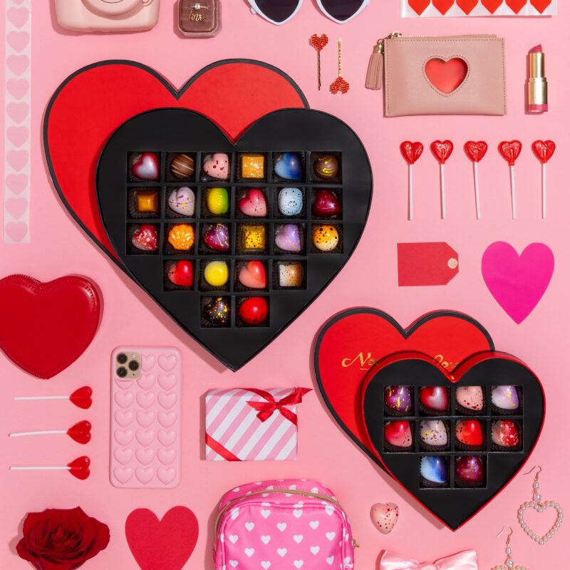
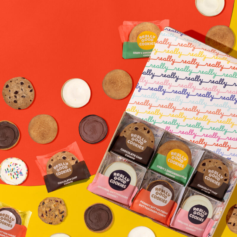
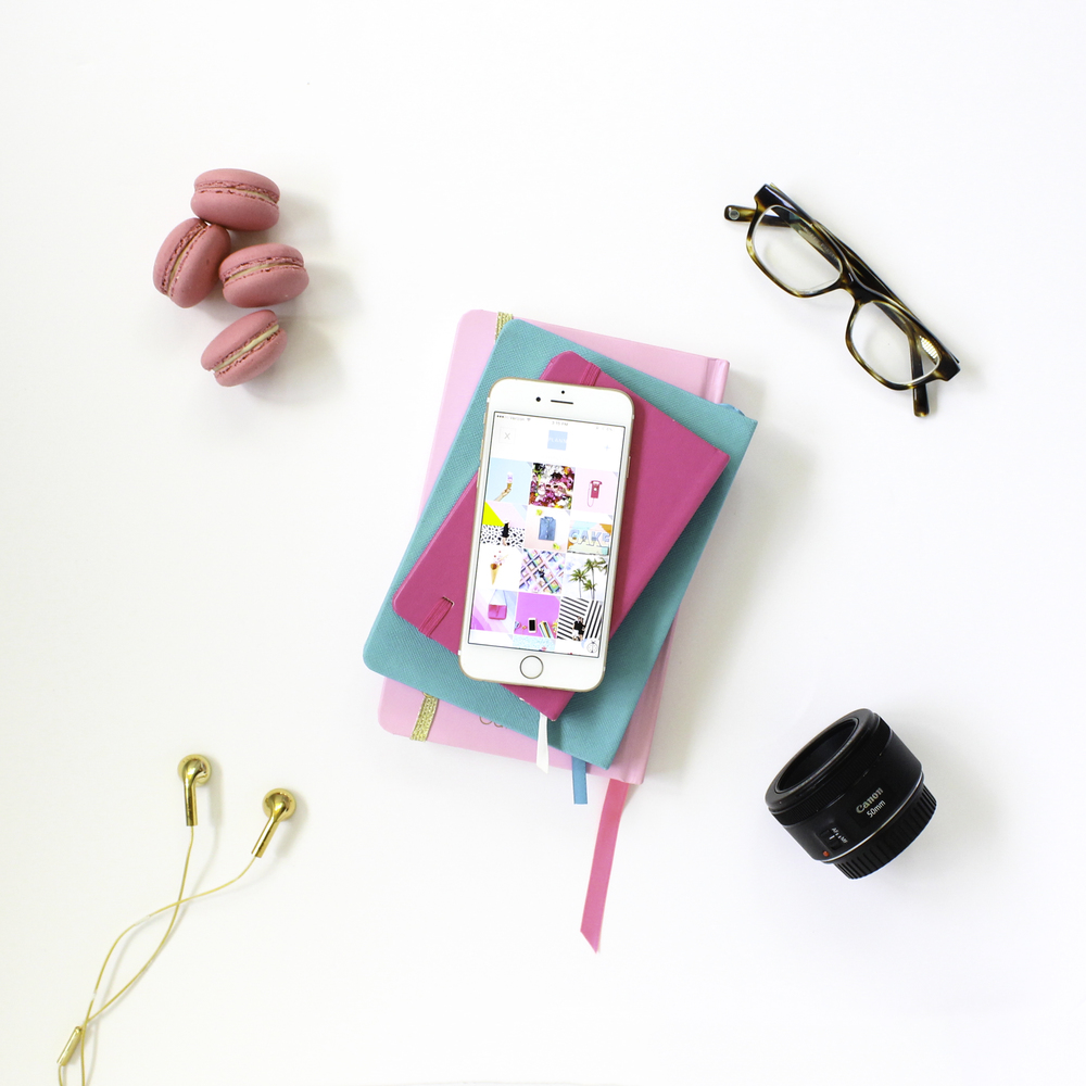
It’s time to photograph new images for social media, yay! After hours of styling, shooting and editing, you’re now left with a fabulous bank of images that you want to share STAT – right? Instead of picking and choosing based on your mood, it pays to have a plan. Beyond your captions and hashtags, I’m talking about the visual look and feel of your feed. The “flow” of the photos from one to the next, or as I like to call it, your “grid game.” Because when someone new searches and finds you on Instagram, they’re not seeing one photo individually, they’re seeing your entire profile, and you want to make the best impression possible. In my grid game, I’ve set and adapted 7 unoffical rules:
1. Never post the same color background back-to-back or stacking
2. Never post two visually “busy” photos back-to-back or stacking – give them room to breathe with negative space!
3. Never post “hands” back-to-back or stacking
4. Never post the same subject back-to-back or stacking
5. Try not to post from the same perspective too often within a set of 9
6. Try to vary colors within each set of 9
7. Always stay consistent with the LISH creative brand of fashion, lifestyle & hospitality imagery
Phew! This list may seem extreme, but I truly believe that it is this level of detail that makes certain feeds stand out.
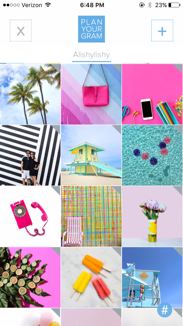
I’ve used a lot of random different apps to plan this flow over the past year, but none have been as visually impressive and flawless as PLANN (*note – this is not a sponsored post, this is just one passionate grid planner to another). You can drag and drop to plan your photo flow, draft captions, save hashtags, the whole deal – all without monthly fees.
If you’ve been using something else to plann, or if you’re new to the grid game, check out PLANN – it’s available for download now in the App Store!
